Introduction:
With today's current level of technology, it is important that web mapping applications function just as well on a mobile device as they do on a computer. This lab was designed to teach students how to optimize web mapping applications for different platforms. In this lab, a query application was created that allows the user to search different features on the map.
Methods:
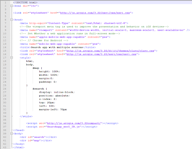
The first section of this lab was creating a web application that allows users to search for a location, congressional district, or a congressman via search bar located in the top of the map. This was done by formatting an HTML file and connecting it to a JavaScript file that contained the code that allows the application to function. Within the HTML page a viewport <meta> tags is used to make the page more responsive to iOS devices. Meta tags are also added to make the page more responsive to chrome and android devices.
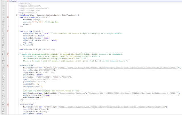
The following two images are the JavaScript files that create and give life to the query map application. Modules are imported and parameters are accessed. Within the JavaScript file, feature classes are imported as services and pop-ups are set. The pop ups are coded to show certain fields from the features. This is also where the search bar is created and put on the map.
The second part of this lab was to publish a service containing Universities around the United States and to connect this service to the web application and format it to search universities as well as the popup. This HTML page is similar to the one in the first part of the lab, it uses meta tags to make the application mobile responsive to different platforms.
The JavaScript for this application is similar to the first section but includes the universities as a service and the pop up is configured for the universities.
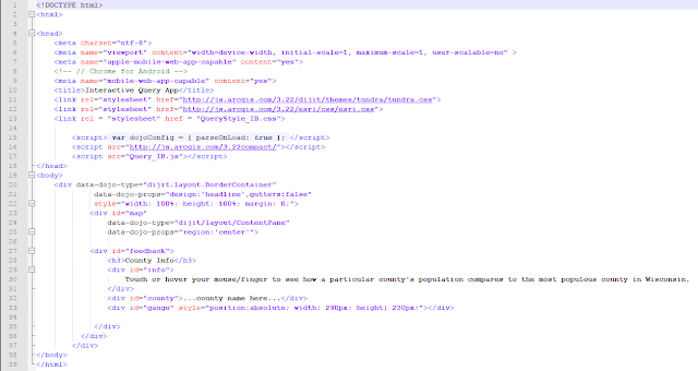
The last part of this lab was to configure a query application that compares the populations of counties in Wisconsin. This application was configured to show a chart in the bottom left corner of the page that compares the county the user clicks on to the county with the highest population in Wisconsin. This page is also set up to be responsive on all mobile platforms.
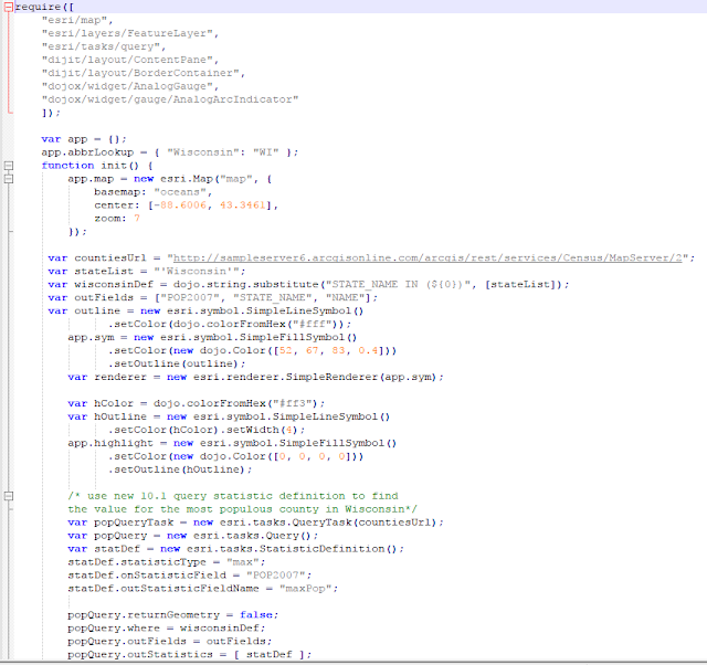
Within the JavaScript file of this page, modules are imported, parameters are set, the map is initialized, the gauge is created and the functionality of the gauge is set up. The query is also set up for the county population that gives the gauge life.
Finally the CSS is created that gives the map layout life and formats the gauge in the bottom right section of the page. The CSS also highlights the county in yellow that the user is hovering over.
Results:
This is the first lab that more function was given to the Web Applications created. The search function created in the first part of the lab is a simple addition that shows up in most web mapping applications. The search function is an easy way for users to easily find a place they are familiar with from there navigate to somewhere else. Besides just finding locations with the search function, the search function allows users to search for things like a congressman, school , or congressional district, this is a very easy way for a person using the application to navigate a large amount of data. The sky is the limit when formatting what can be searched for in the search bar, it simply needs to be added into the code. The query application that was created is the most powerful thing that has been created in this class so far. It takes data and manipulates it so the user just see's the result and not a clutter of data. This only shows the user one aspect of data, in this case, percent population in relation to the most populous county in Wisconsin. It is displayed using a gauge on the bottom of the page and allows no room for the user to be confused about what the application does.


No comments:
Post a Comment